Ahh, Australia. We might be a sunburnt country some 14,000kms from Positano, but we certainly still share the same love of lively, animated conversations and tasty sundowner drinks as our Italian brothers and sisters.
Sure, they invented the fine art of aperitivo hour (and we all know that Italians are famous for doing things better than most🤌🏼)
However, we believe that when it comes to SOFI Aperitivo, we prove that Australians—just might—do it best. 🤙🏼
How? It all starts with…

A captivating first impression.
Like catching the eye of a charismatic stranger, shaping the branding for SOFI Aperitivo was about creating a sense of modern yet familiar allure.
Luckily we’d already made an acquaintance with the brand, helping to elevate their ready-to-drink spritz offering since 2015. Shifting gears to create SOFI Aperitivo’s branding meant leaning into a feeling of discovery and self-expression.
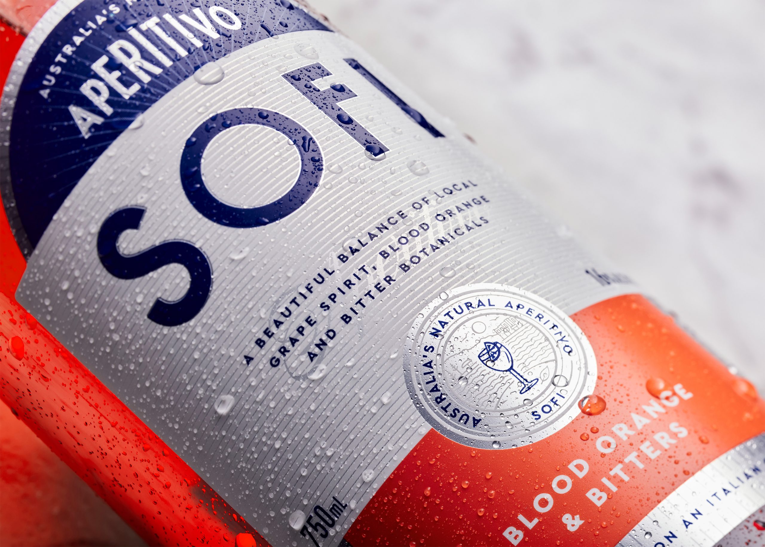
Thus, the ‘local twist on an Italian classic’ brand position was born, marrying Italian art deco with modern Australian design styles.

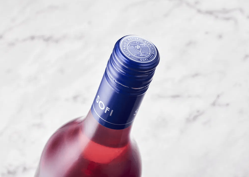
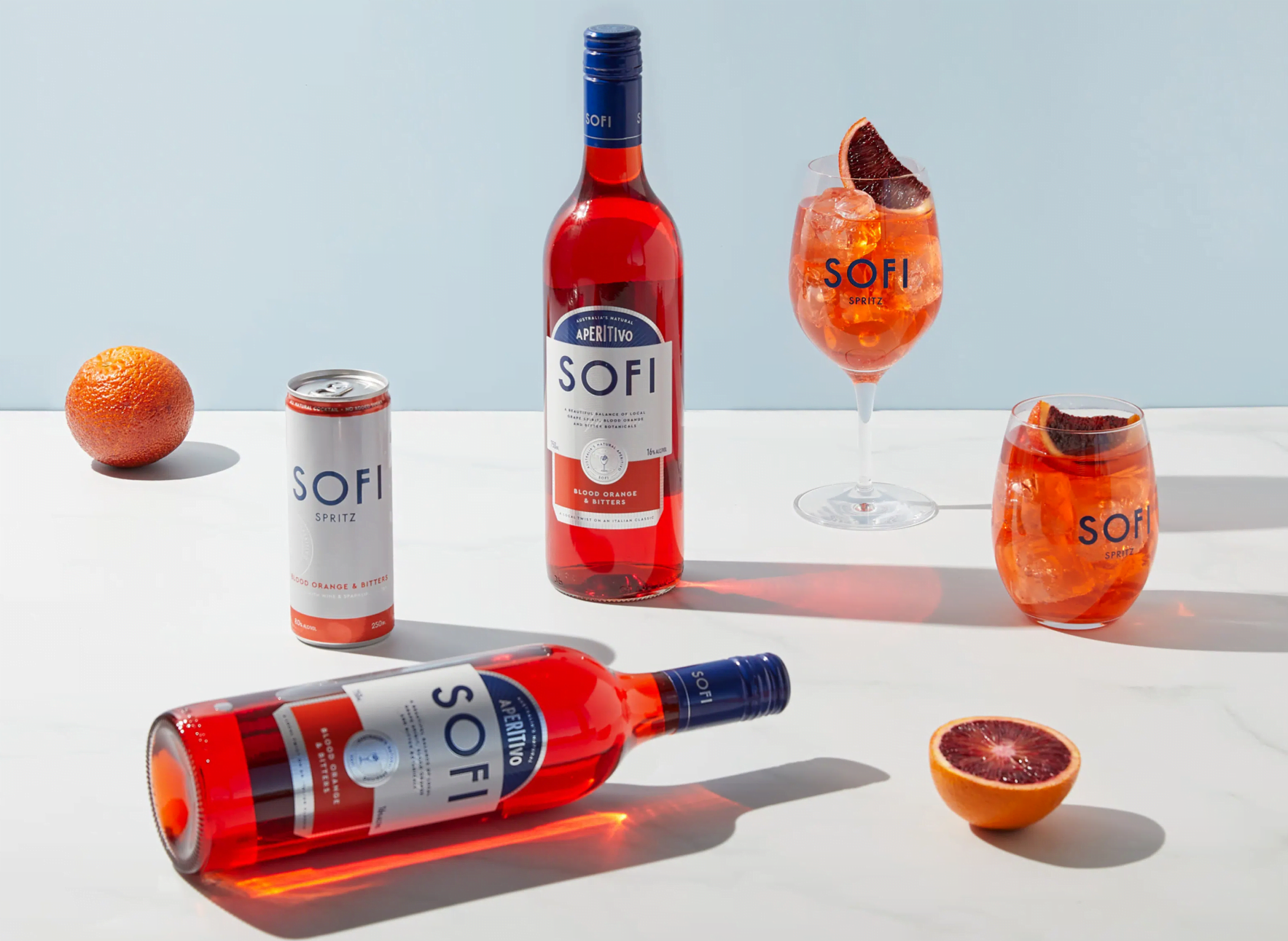
SOFI’s crisp blue and white colour scheme is artfully blended with Art Deco-inspired arched lines and type treatments. A metallised label and fine detail offer a hint of premium flair. The result is a style that is elevated but at home, established yet approachable, that comfortably slots anywhere good times with friends are had–and is worthy of a dressed table setting (preferably pool or beachside).
Speaking of friends…
When your brand is all about being social, you’ve got to walk the walk.
If branding is the entree, social media is the main course, and boy did we aim to serve when it came to crafting up the visual and tone for SOFI.
Fun fact: Australians are full of contradictions when it comes to digital content. We love a quality, high-level aesthetic, but we like it tempered with a cheeky wink. We don’t take ourselves too seriously, but we’re serious about a good time.
There’s a unique zest to life in the southern hemisphere. That’s why with SOFI Aperitivo you’ll see plenty of light bright imagery that harks to summer Down Under—with pops of blue, golden sunshine and measured serve of colour to balance carefree approachability with timeless sophistication.

To talk the talk? You need an accent.
A drink with a modern Australian twist needs copy to match. We like to think of it as a conversation with a well-travelled friend you’re dying to catch up with. There’s anticipation, joy, and an inside joke here and there.
Like a great cocktail, we understood that SOFI’s copy ingredients needed to be well balanced.
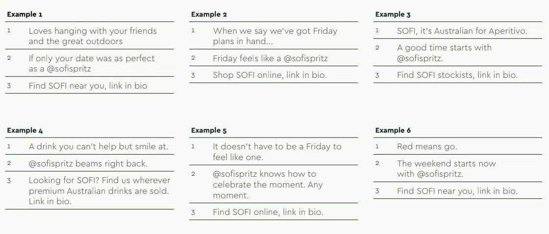
So we created a formula for post copy, creating a structure of—headline, ‘garnish’ and call to action—for the brand’s social media manager to copy.
This maintains the SOFI tone, but also provides inspiration for zesty hardworking captions down the line.

Speaking of social events…
Finally, you need a great event space (or website).
Standing out in the alcoholic bev space is serious biz, especially when it comes to brand-led websites. However, you never want to make customers feel all the hours of effort and work behind the scenes.
A great brand website should feel like a vacation from reality and a portal into a perfect world.
So with SOFI, it felt natural to make sure sofispritz.com felt as warm as a summer day and as refreshing as a dip at Bondi Beach.
Plenty of mouth-watering images of expertly crafted cocktails, inspirational shots of purple-pink sunset skies, hints of Australian surfboard culture, and just enough elevated touches to say ‘this is a party that everyone’s invited to but be sure to wear your best summer threads’.
At Squad Ink we love adding a uniquely Australian perspective to new and established brands. When that brand is all about putting a local slant on an international flavour? It’s about leaning into the commonalities and celebrating the little differences with artful subtlety
You don’t even have to say ‘G’day’, you just have to get it right.
