
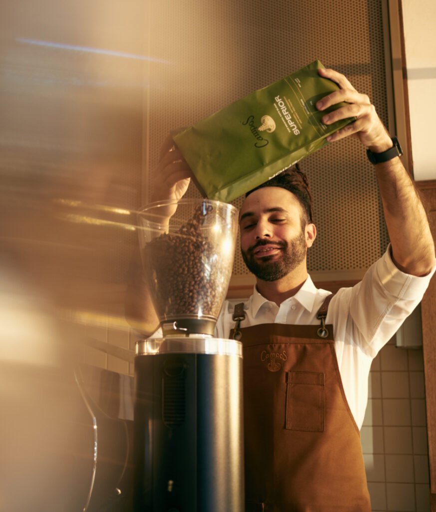
Evolve Campos’ packaging identity to capitalise on the competitive advantage of the iconic green cup, a symbol of quality. Inspire customers in major supermarkets to explore the full range. Strengthen brand loyalty in cafes. Bring the cafe-centric heart and soul of Campos to life on every pack.
The coffee category has been flooded with new-to-market independent coffee brands. For Campos to rise above the pack, it became more important than ever for quality, prestige, and authenticity cues to be strengthened on their packaging.
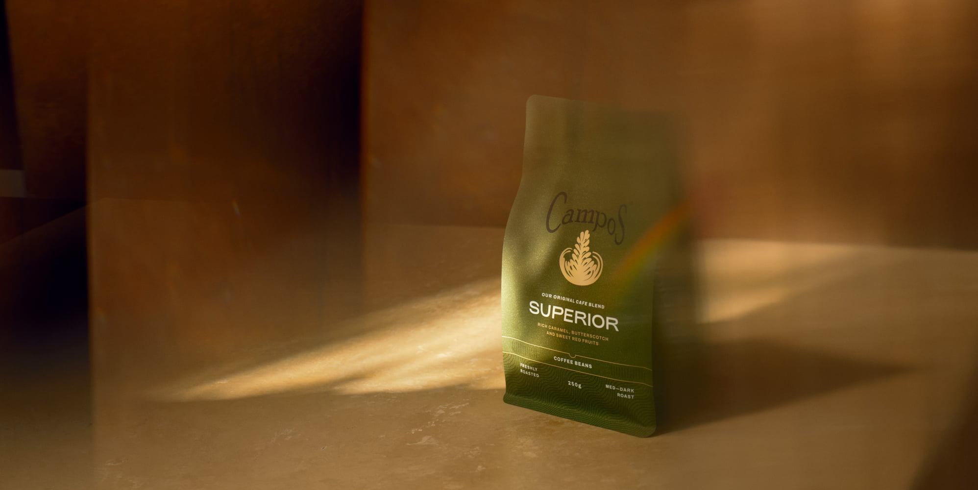
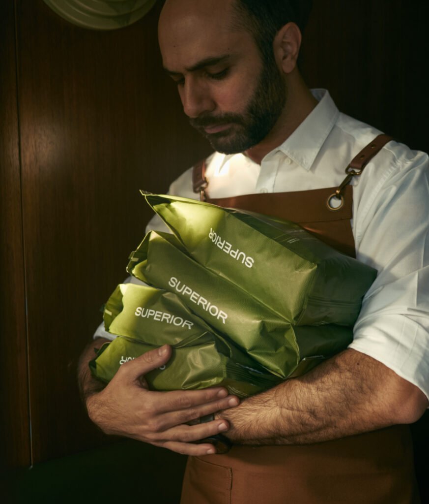
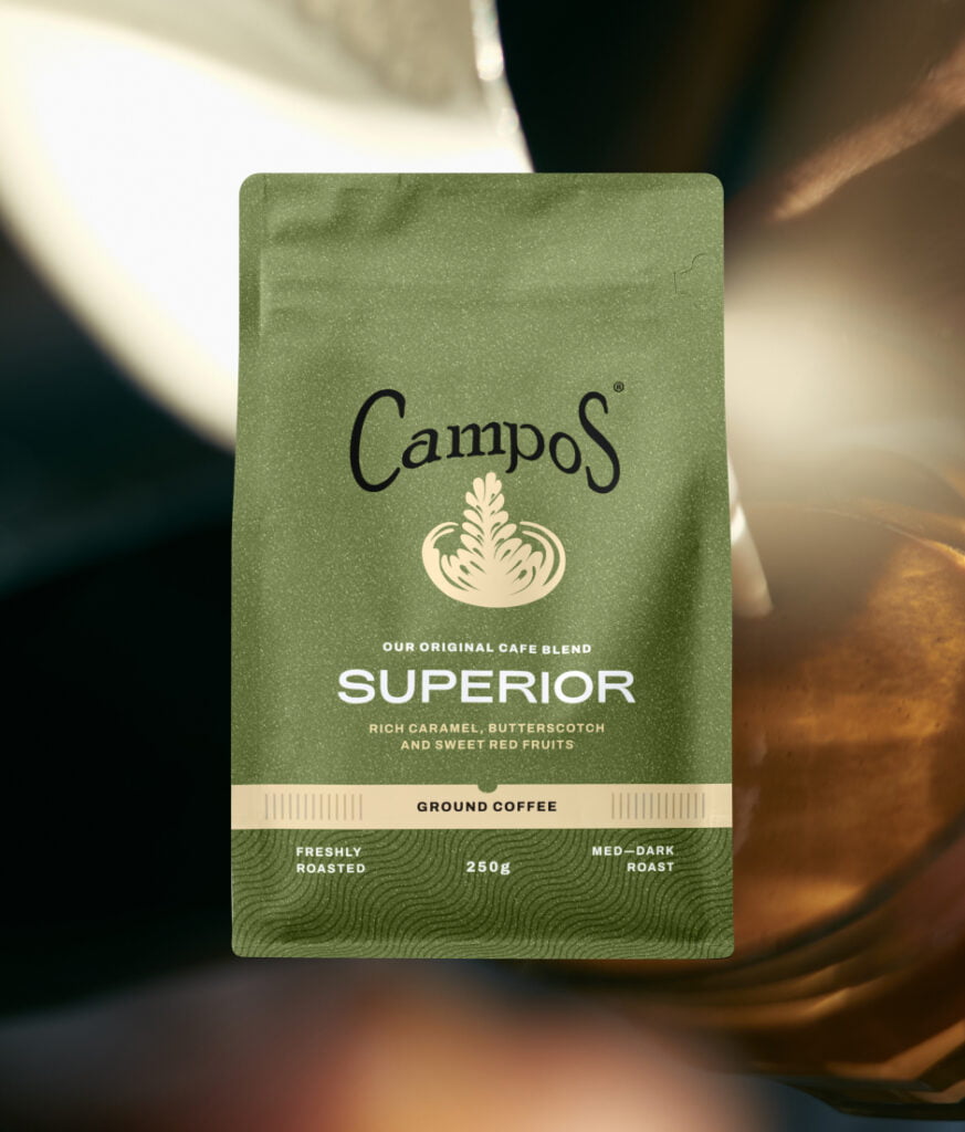
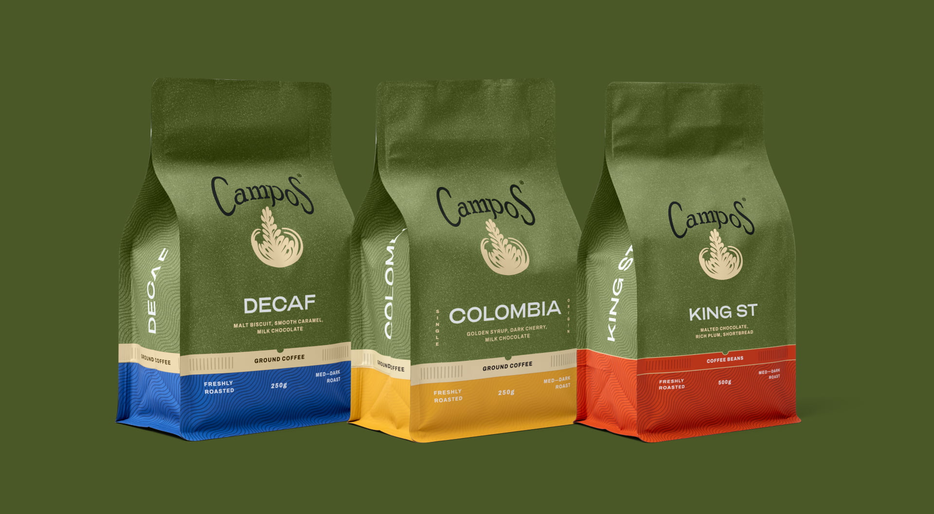
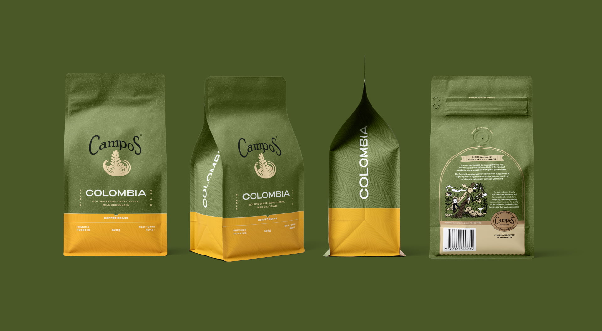
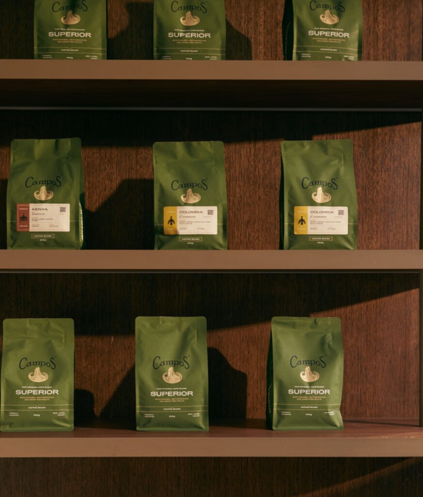
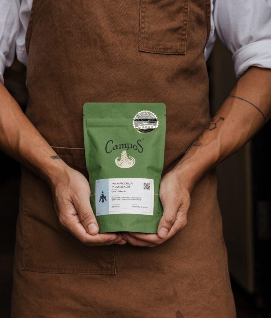
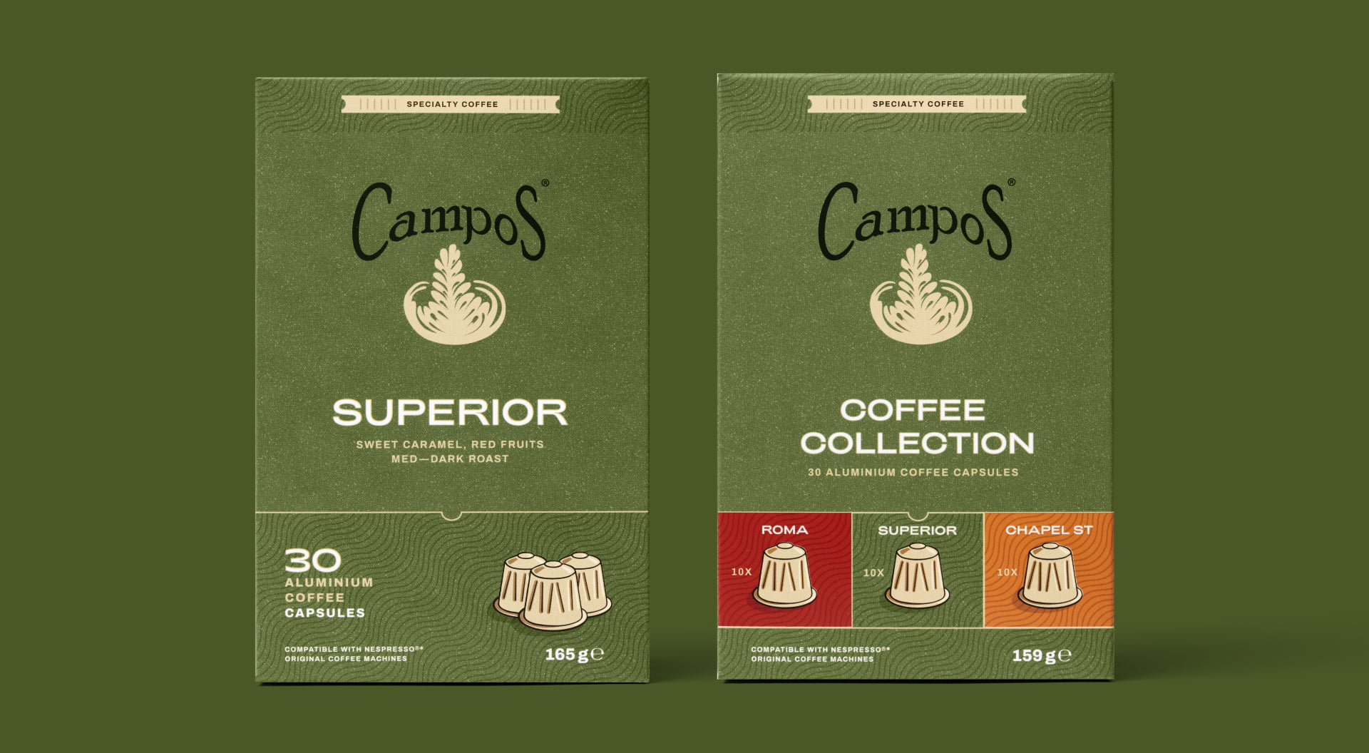
We balanced an artisanal and modern aesthetic to create relevance amongst a broad range of consumers without diminishing Campos’s essential heart and soul character. Previously, the Campos green was under-utilised so we strategically rolled it out across all packs to establish clear colour-blocking on the shelf. A grainy printed texture and metallic accents were also applied to elevate the humble foil-lined bag.
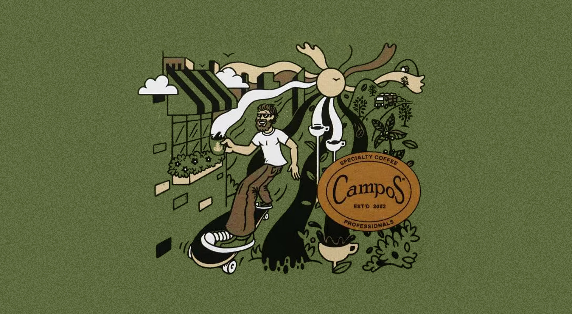
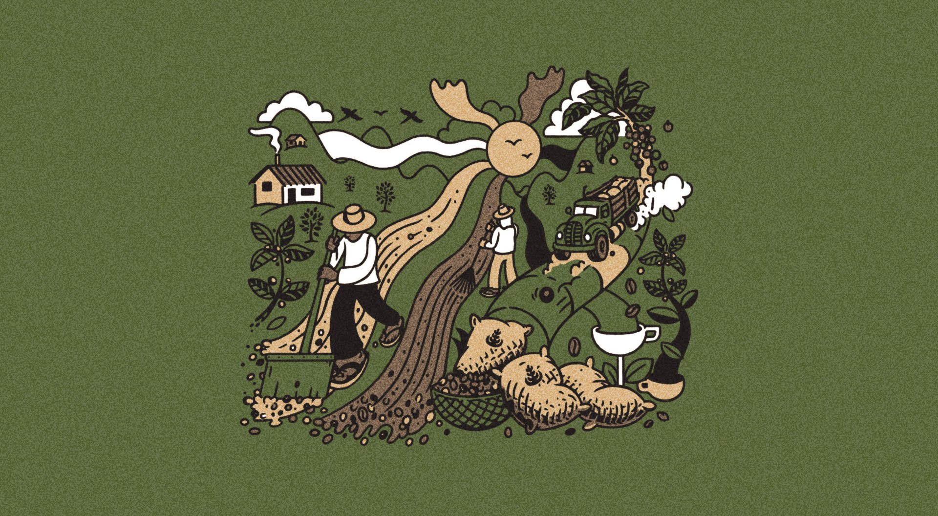
The Campos café origin story which began back in Newtown in 2002 reinforces their coffee heritage and connection to the community. This thriving café culture became our north star as we loosened up the packs with youthful illustrations, capturing the joy and magic of Australia’s much-loved cup.
We introduced a brand seal and a new tagline,” There’s coffee, then there’s Campos” which reinforces their brand prestige and consistent quality.
Range updates were distributed in July 2024 and were very well received amongst cafes and retailers. We look forward to reviewing performance metrics in the coming months.
Brand Strategy
Design
Illustration
Key Messaging
Packaging

Sign up to be the first to know about updates, new projects, and all things SQUAD.