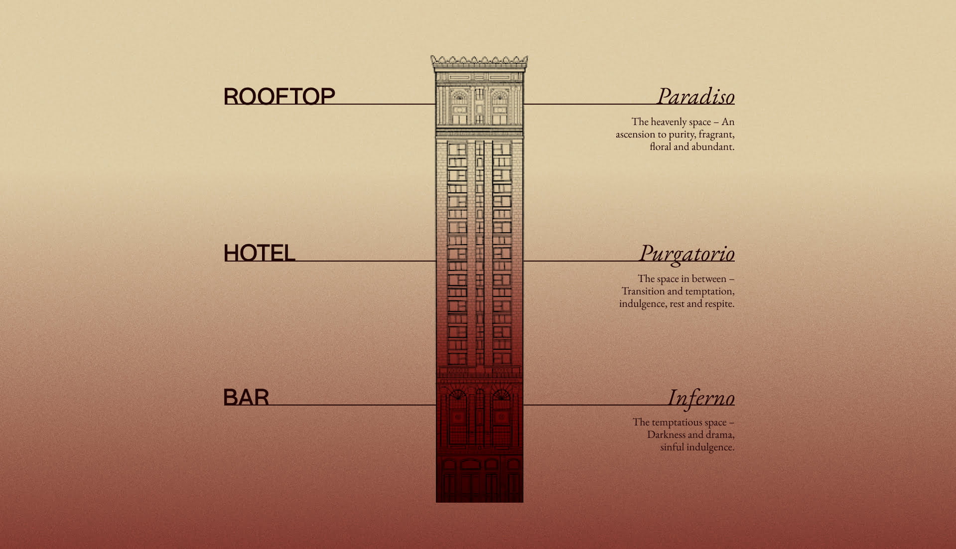
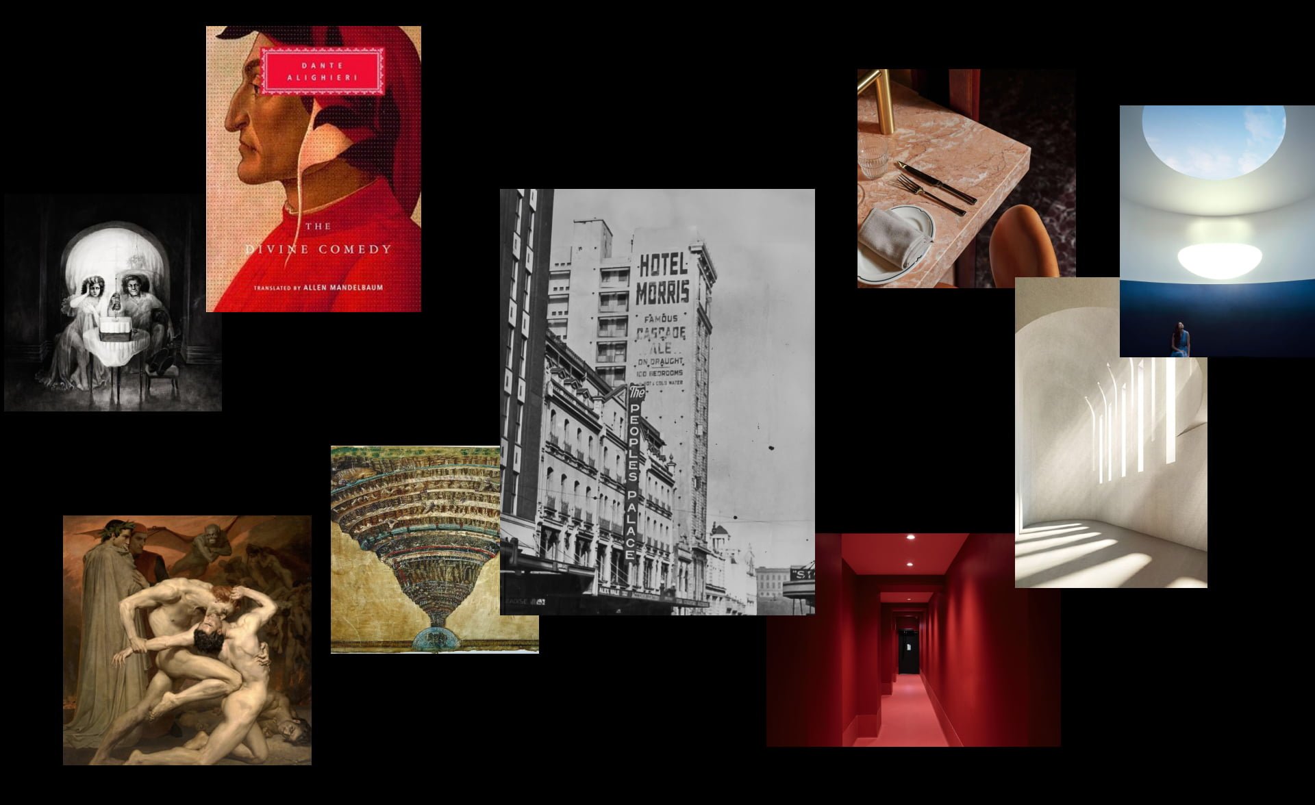
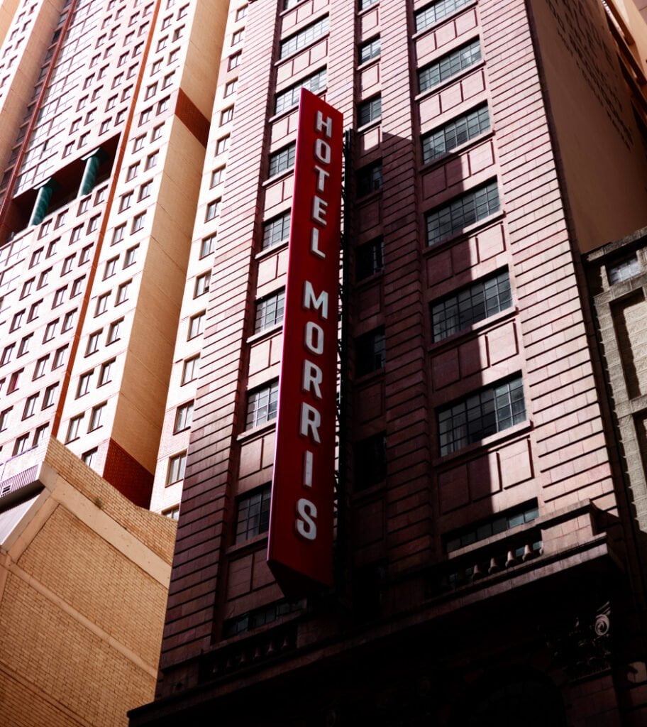
Housed within a striking Italian renaissance building with palatial Art Deco features, the immediate barrier was navigating the restraints of a heritage-listed building that imposed limitations on layout and space. Our task was to develop an integrated concept for the lobby & bar, hotel and rooftop that connected to the architectural, historical and cultural truths of the building and downtown area. Offering whispers of the past yet with a modern sensibility, our collective challenge was to revive this architectural gem to its former glory whilst delivering a unique hotel brand and experience to the city.
Lobby & Bar
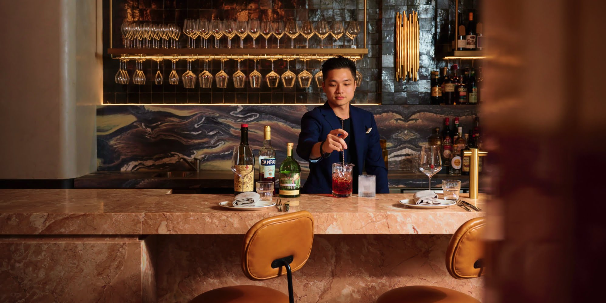
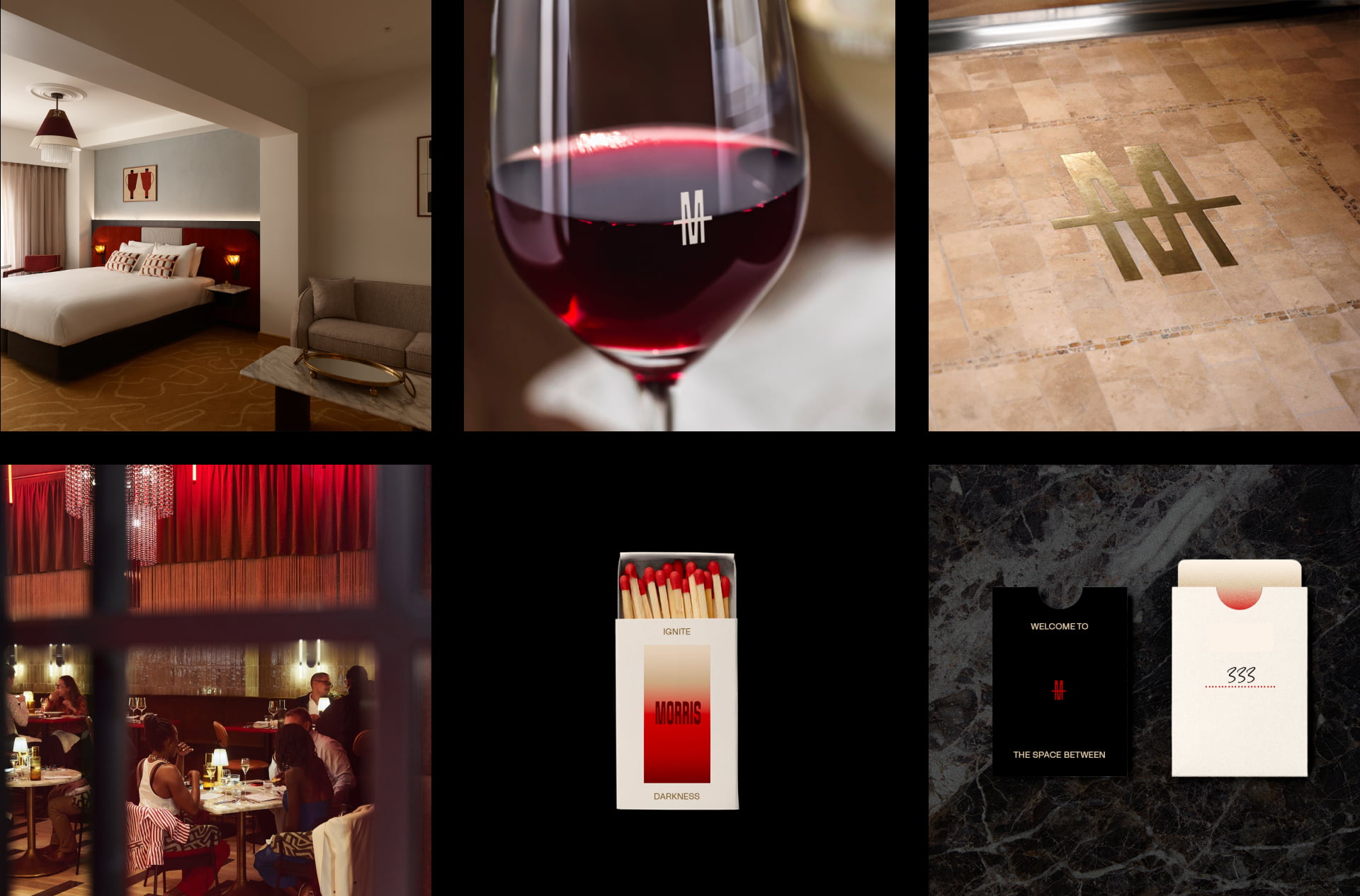
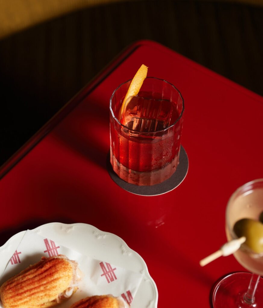
An intoxicating and sensory introduction to the concept and hotel experience, the lobby and bar sets the stage with a seductive use of red and dramatic marble features. On arrival, guests are complemented with Italian almond tea infused with orange and Earl Grey tea. Over at Bar Morris, a light yuzu negroni (Negroni Bianco) and dark negroni (Negroni Speziato) furthers the narrative with a play on light and dark. Guests can partake in a game of chance—a roll of red dice might reward you with a shot of bitter-sweet amaro at the end of your meal.
Hotel
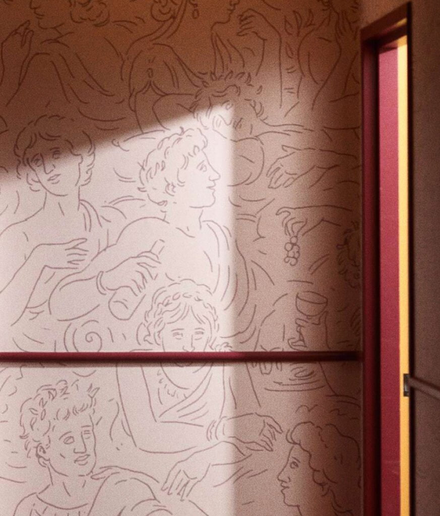
Welcome to the space in between. Designed with a warming residential aesthetic to create a sense of familiarity and calm. A space for rest and respite whilst tempting guests with both innocent and guilty pleasures. Gracing the hallways is a decorative hint to the concept, illustrated wallpaper depicts romanesque figures playing out acts of indulgence. In-room touches such as Sicilian playing cards and a curated mini bar of local delights create subtle ties to the concept narrative.
Rooftop
Yet to launch, the rooftop bar is all about ascending to purity, abundance and ethereal charm.
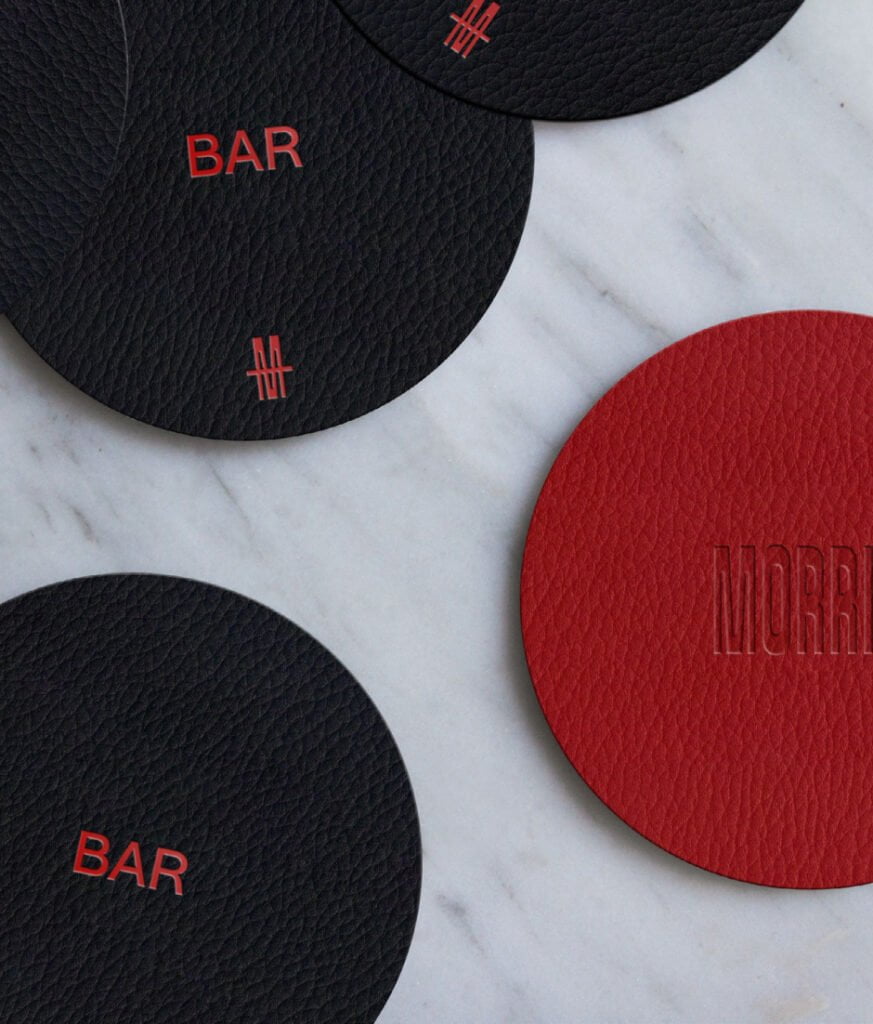
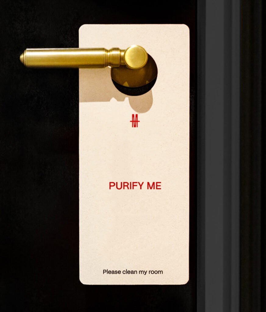
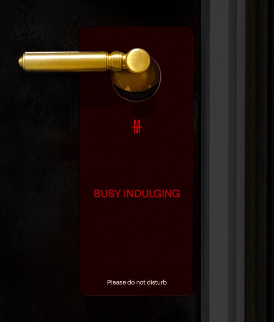
The brand concept is woven throughout the spaces to provoke intrigue and enrich the guest experience at every turn. Purposeful brand-touchpoints like a room card with ‘Welcome to the space between’ and make up room signs with ‘Purify me’ or ‘Busy indulging’ lure guests deeper into the Hotel Morris world.
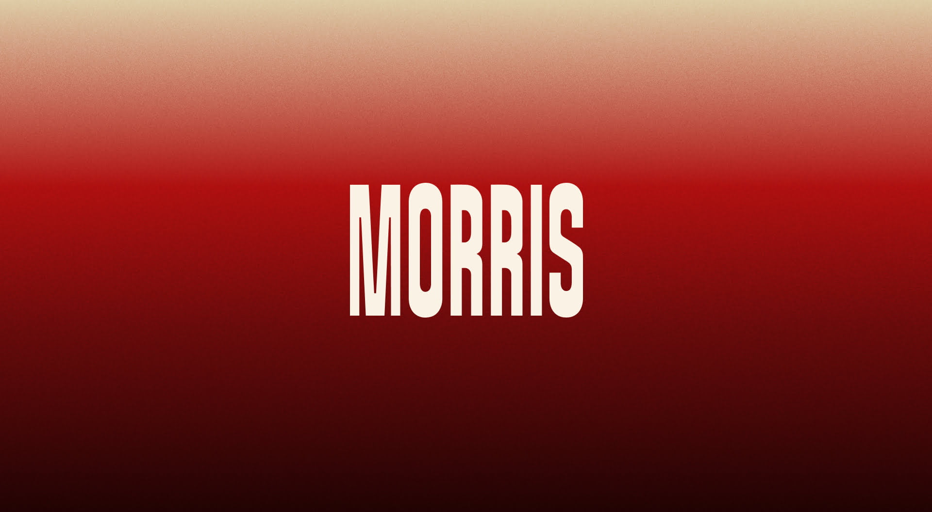
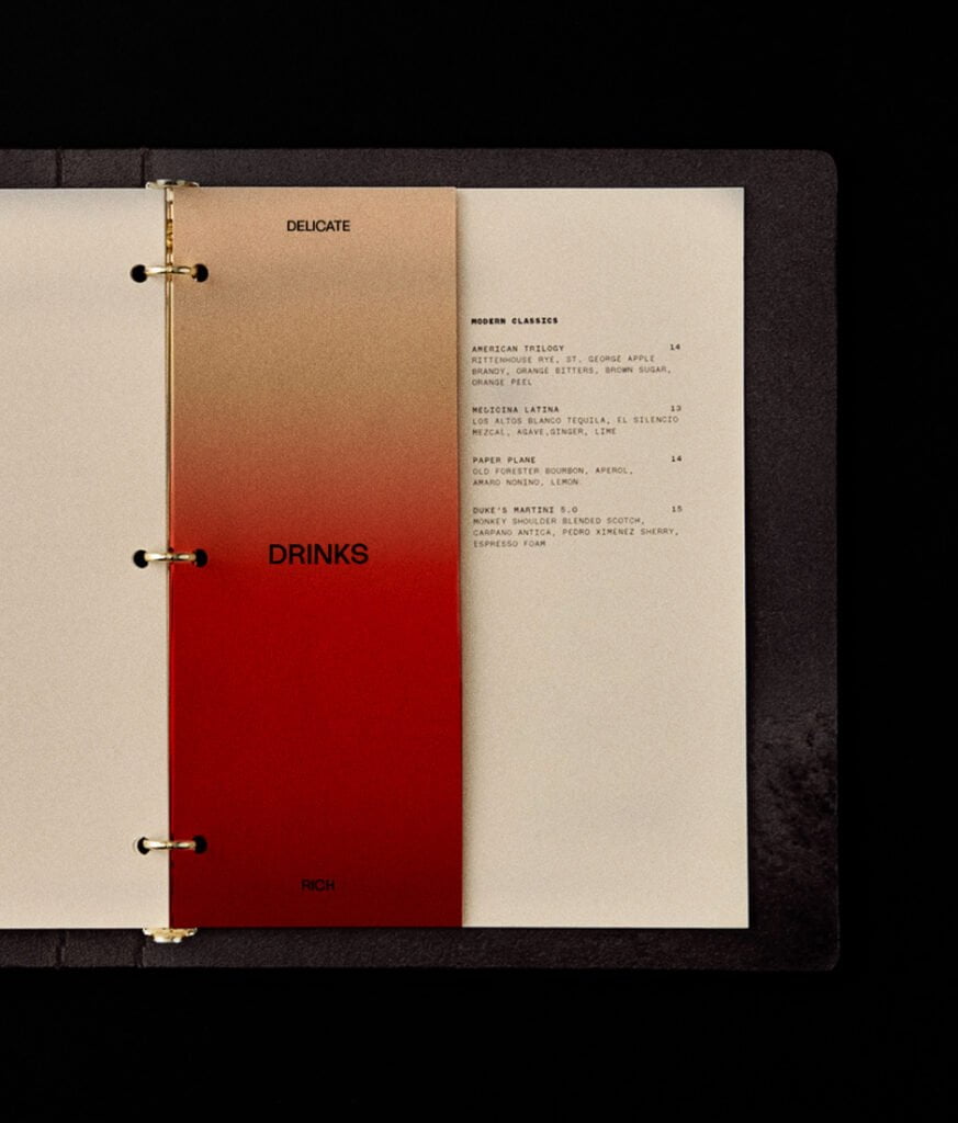
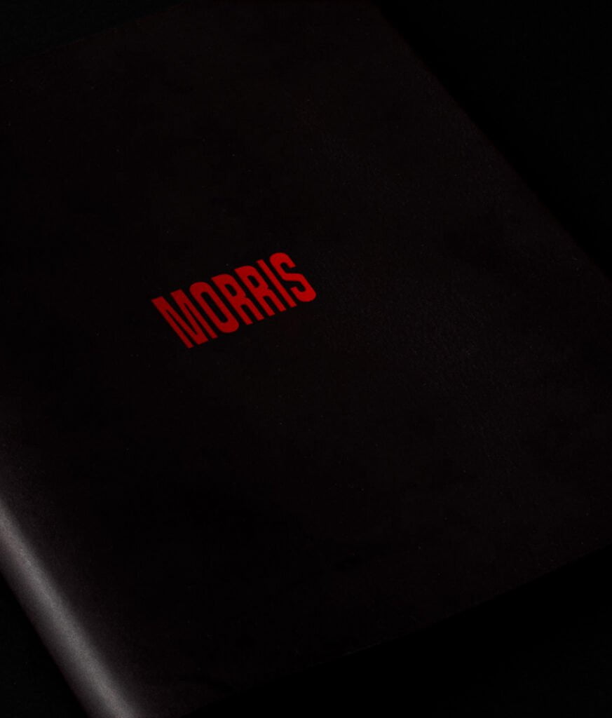
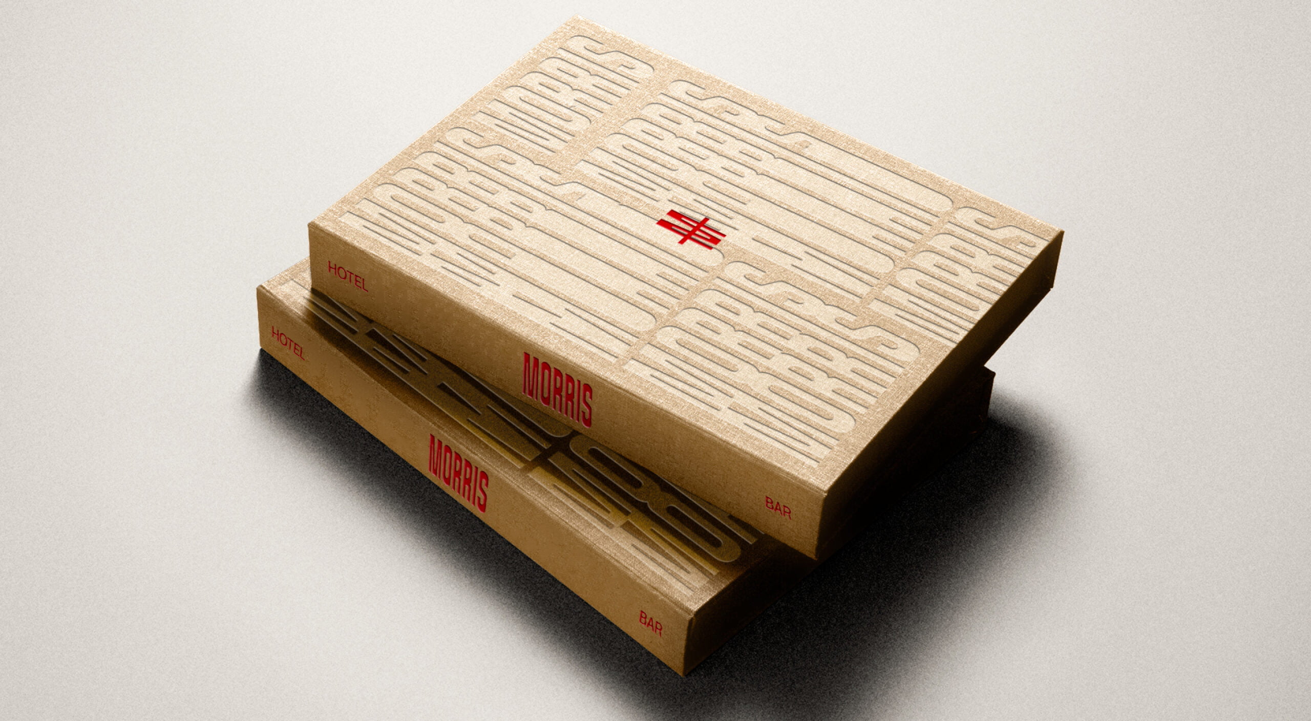
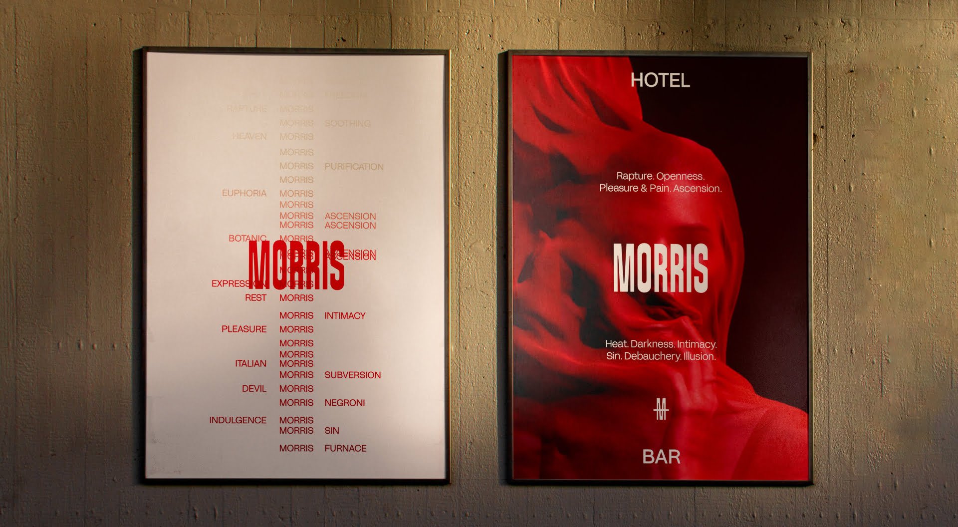
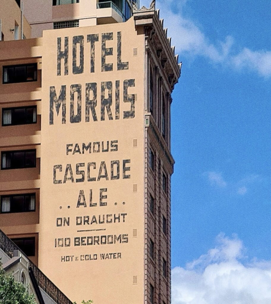
The wordmark is inspired by the original hand-painted typography—restored by Lynes&Co—that features on the side of the building. Our evolved version is distorted upwards to play to the distinctive tall and narrow building architecture. The idea of ‘transition’ through the spaces (from lobby & bar to hotel to rooftop) is visualised through the use of the brand’s gradient—transitioning from a deep seductive red to lighter earthy tones.
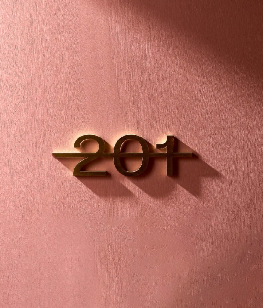
The brand mark is symbolic of the tall iconic building whilst the line striking through the M reinforces the transitional journey through the various spaces and underscores the tagline, ‘Welcome to the space in between’.
Inspired by the brand mark, we developed a wayfinding guide that informed the signage design throughout the hotel. We created illustrated wallpaper that graces the hallways of the hotel—depicting romanesque figures playing out acts of indulgence, a tasteful hint to the concept.
Hospitality Concept
Fellow Hospitality
Interior Design
Tom Mark Henry
DA/External Heritage Works Architect
Architectural Projects
Interior Planning for Suites
Place Studio
Exterior hand-painted signage
Lynes&Co.
Photography
Steven Woodburn
Art Direction
Brand Identity
Brand Strategy
Naming
Signage
Venue Concept
Hospitality Concept
Fellow Hospitality
Interior Design
Tom Mark Henry
DA/External Heritage Works Architect
Architectural Projects
Interior Planning for Suites
Place Studio
Exterior hand-painted signage
Lynes&Co.
Photography
Steven Woodburn
Sign up to be the first to know about updates, new projects, and all things SQUAD.