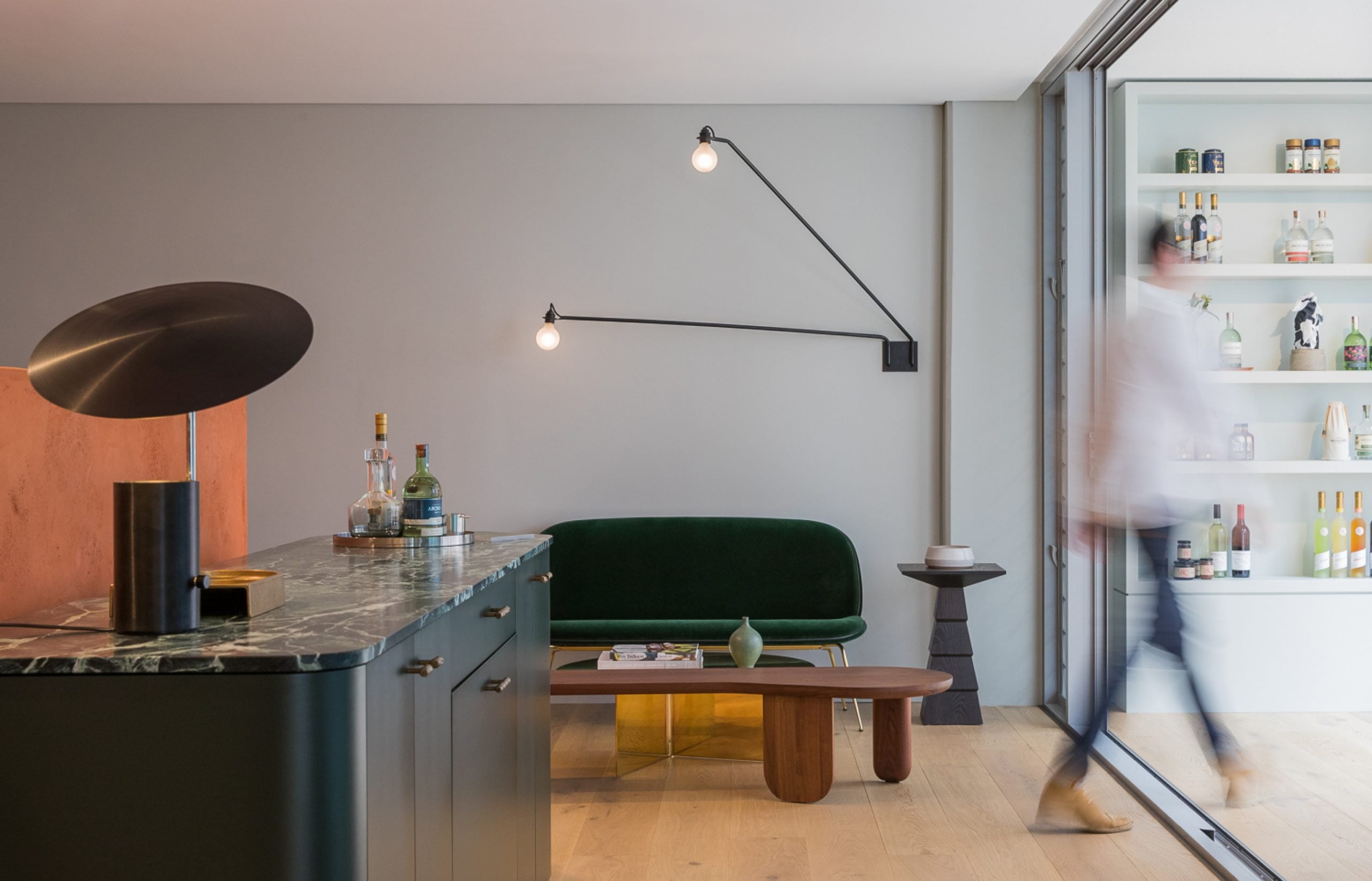

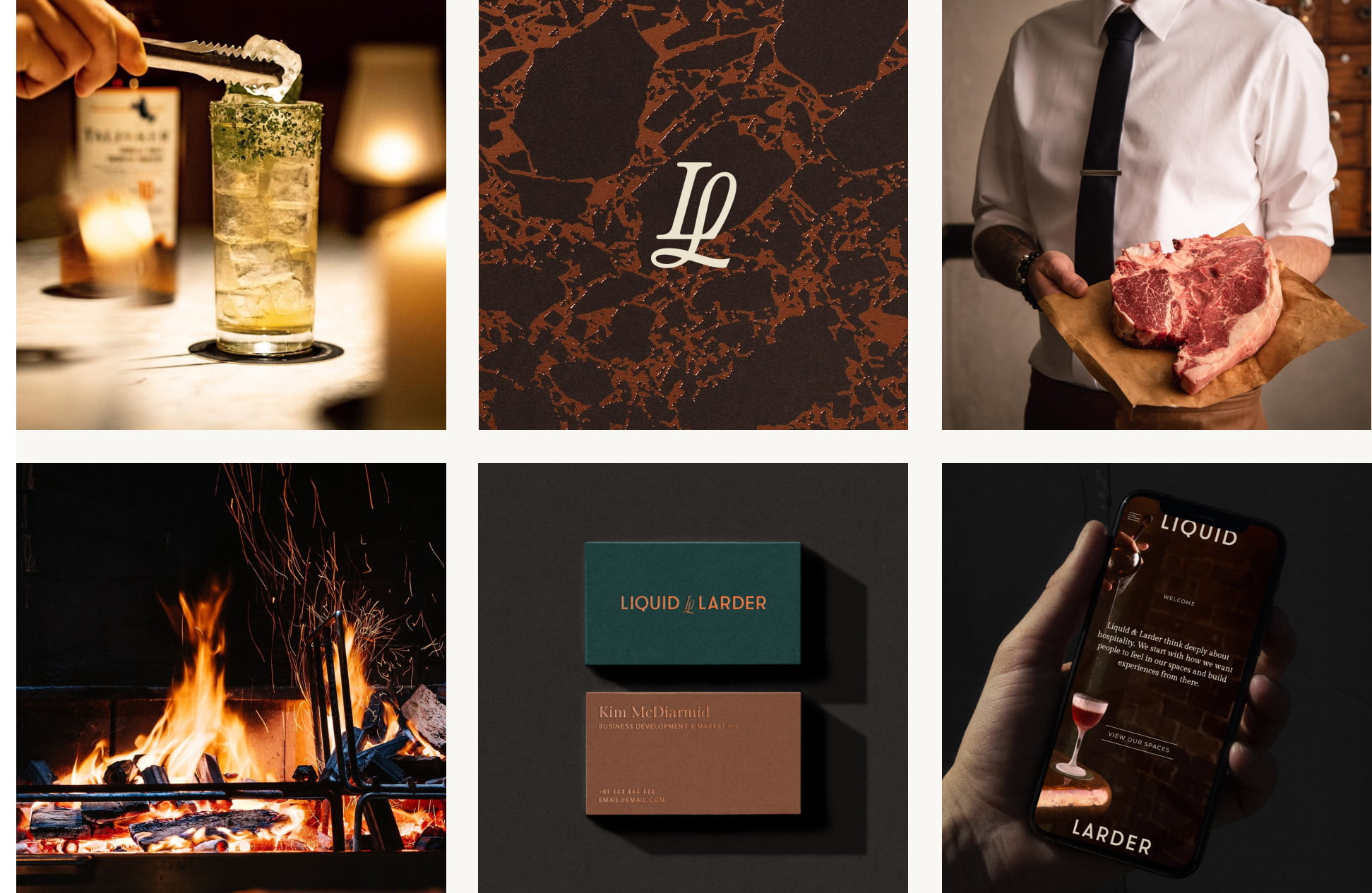
We’ve worked with Liquid & Larder for 6 years, branding five of their Sydney gems—The Gidley, The Rover, Alfie’s Steakhouse, and the newly launched Bar Julius and Lottie Rooftop at The Eve Hotel. Their growing venue portfolio prompted an audit of the group brand and online presence. SQUAD guided them through a strategic rebrand and website platform that captures their true identity and ushers them into a new chapter of growth.
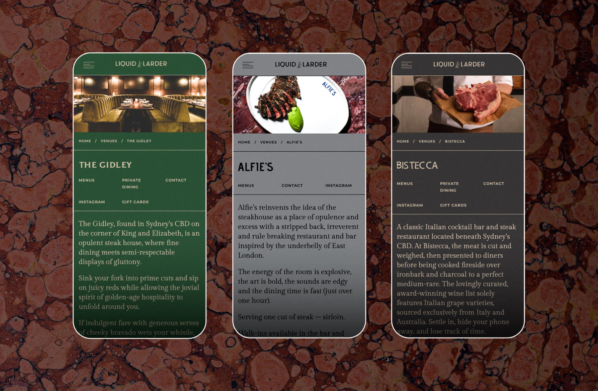
ALL CLASS, NO FUSS. The website design is as immersive and intuitive as Liquid & Larder venues’ guest experience. Our task: To design a flexible structure that future-proofs L&L’s growing venue portfolio, whilst capturing the character and charm of each venue through curated content and a customisable palette.
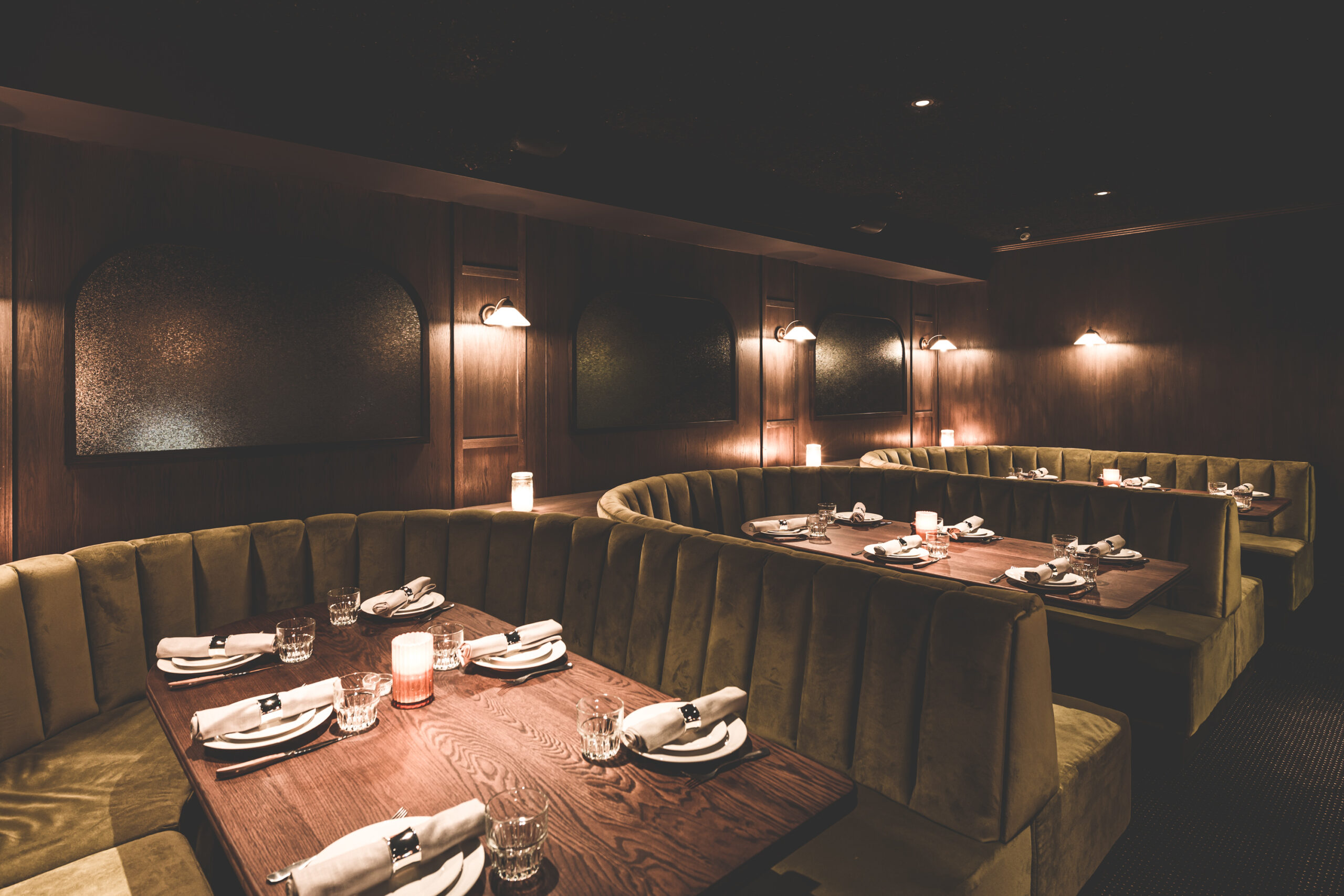
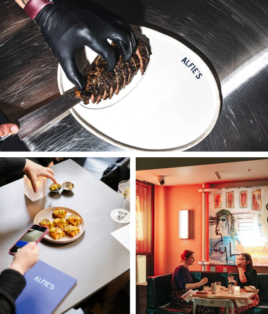
Alfie’s reinvents the idea of the steakhouse as a place of opulence and excess with a stripped back, irreverent and rule breaking restaurant and bar inspired by the underbelly of East London. The energy of the room is explosive, the art is bold, the sounds are edgy and the dining time is fast. Serving one cut of steak – sirloin.
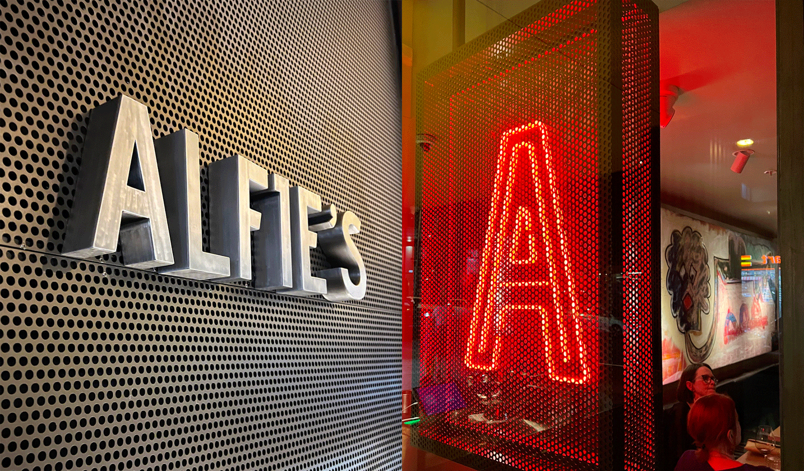
From strong brand messaging to custom signage and placemaking moments, we unleashed Alfie’s concept throughout the space. A standout moment is the projection video reel that washes the wall of the dining space with an eclectic mash up of eye candy.
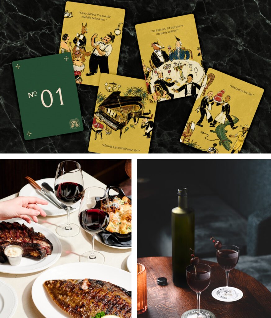
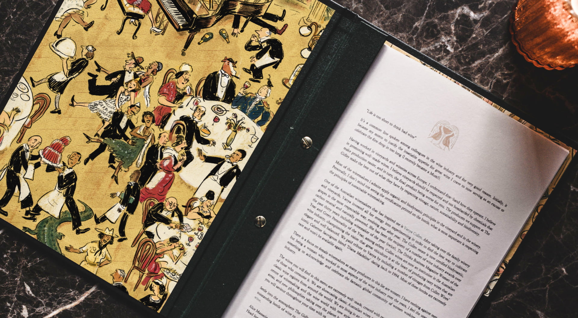
The Gidley, found in Sydney’s CBD on the corner of King and Elizabeth, is an opulent steak house, where fine dining meets semi-respectable displays of gluttony.
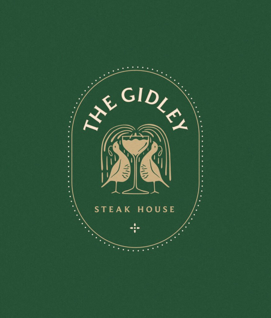
We created a charming and character-filled brand identity that captures The Gidley’s immersive dining experience. Starting with the brand mark, here two Californian quails enjoy a celebratory champagne fountain. The concept draws from the backstory of Captain Philip Gidley King, third governor of News South Wales and his love affair with Norfolk Island, where this dapper flightless bird would proudly strut.
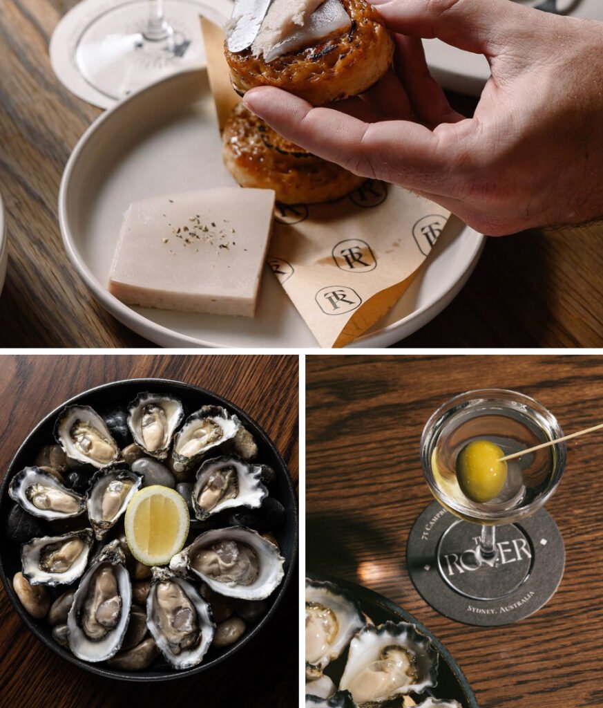
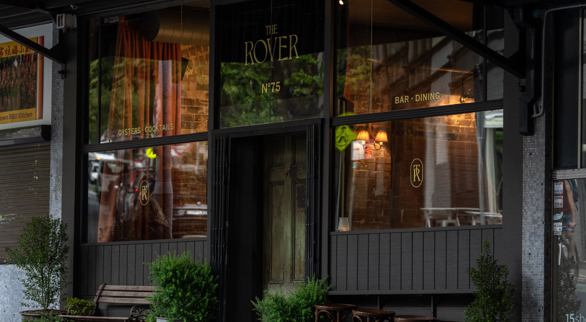
Once a swashbuckling, foot stomping, riotous Surry Hills speakeasy… The Rover, re-emerges with the bustling charm of an Irish tavern and the sophistication of a dapper cocktail bar. Bespoke gold leaf signage and carefully executed brand moments elevate a fairly modest exterior and lure patrons in from the dark.
Interior design by Tom Mark Henry
Alfie’s photography by Buffet Digital
The Gidley & The Rover photography by Dominic Loneragan
Alfie’s commissioned art by Steven John Clark
The Gidley illustration by Jeffrey Phillips
Art Direction
Brand Identity
Brand Strategy
Signage
Venue Placemaking
Website
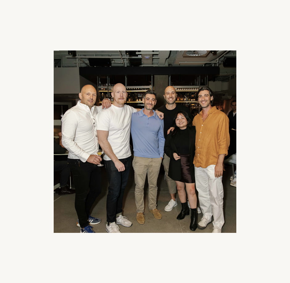
“Embarking on a company rebranding journey required careful consideration to help build on the brand equity of Liquid & Larder. SQUAD’s guidance, creativity and profound passion for the hospitality industry helped bring our vision to life.”
Interior design by Tom Mark Henry
Alfie’s photography by Buffet Digital
The Gidley & The Rover photography by Dominic Loneragan
Alfie’s commissioned art by Steven John Clark
The Gidley illustration by Jeffrey Phillips
Sign up to be the first to know about updates, new projects, and all things SQUAD.