
Our brief was beautifully simple: “Capture the essence of what we love most about gin and drinking gin together in a brand and bottle… that can resonate with vodka and gin lovers locally and internationally”. So naturally, we uncovered what this ‘essence’ looks, feels and tastes like whilst intentionally navigating towards a solution that is incredibly unique and differentiated from any gin out there. The design had to personally resonate with the founders, so we needed to dive into their ideal gin experiences; channelling memories of sipping seaside, spontaneous chance encounters, and go-to serves—gin, soda and citrus. Simple and satisfying.
What made this project so successful was the intuitive meeting of creative minds between our team and the founders. It’s that journey that led us to a winning idea which we aptly named, “Effortless Summer Escapes”.
As co-founder Tom Ackerly put it “We’re looking for a bottle that feels right at home nestled into the sand or slipped into a backpack, but can show up confidently on a back bar.”
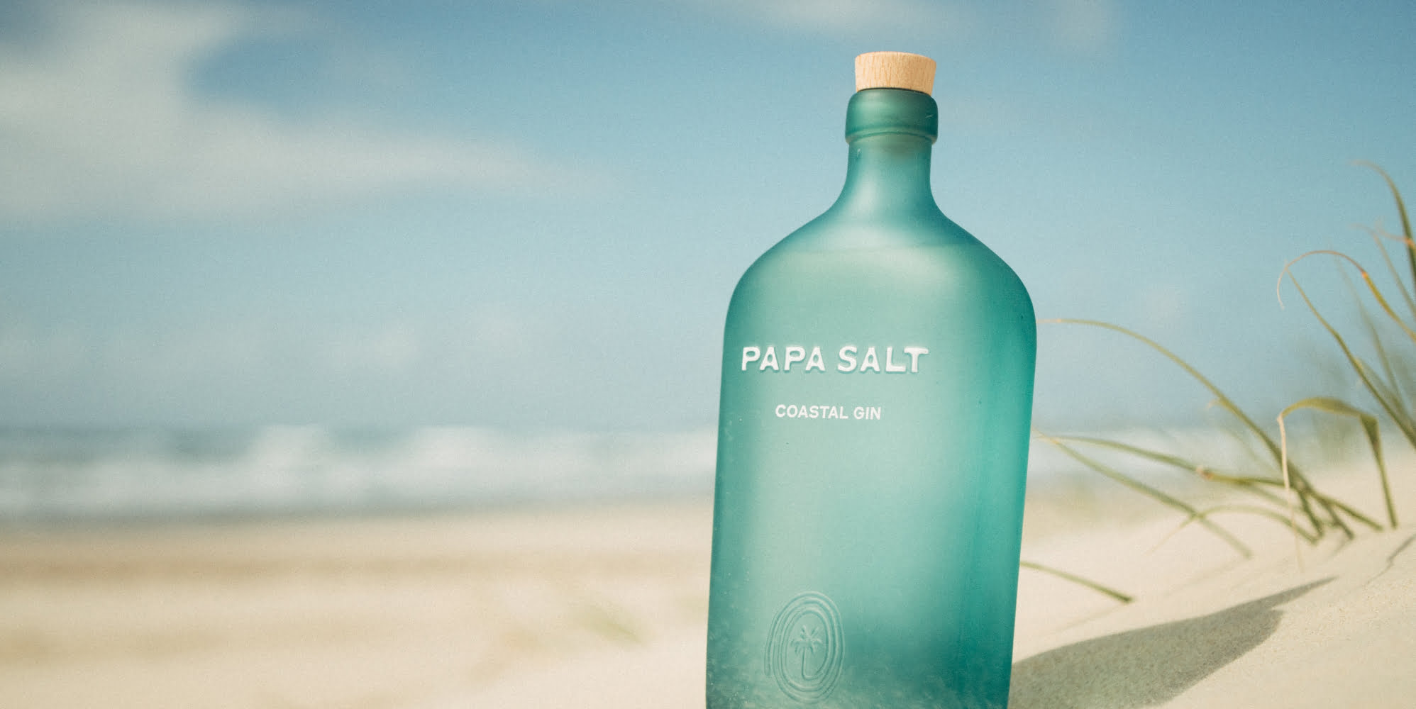
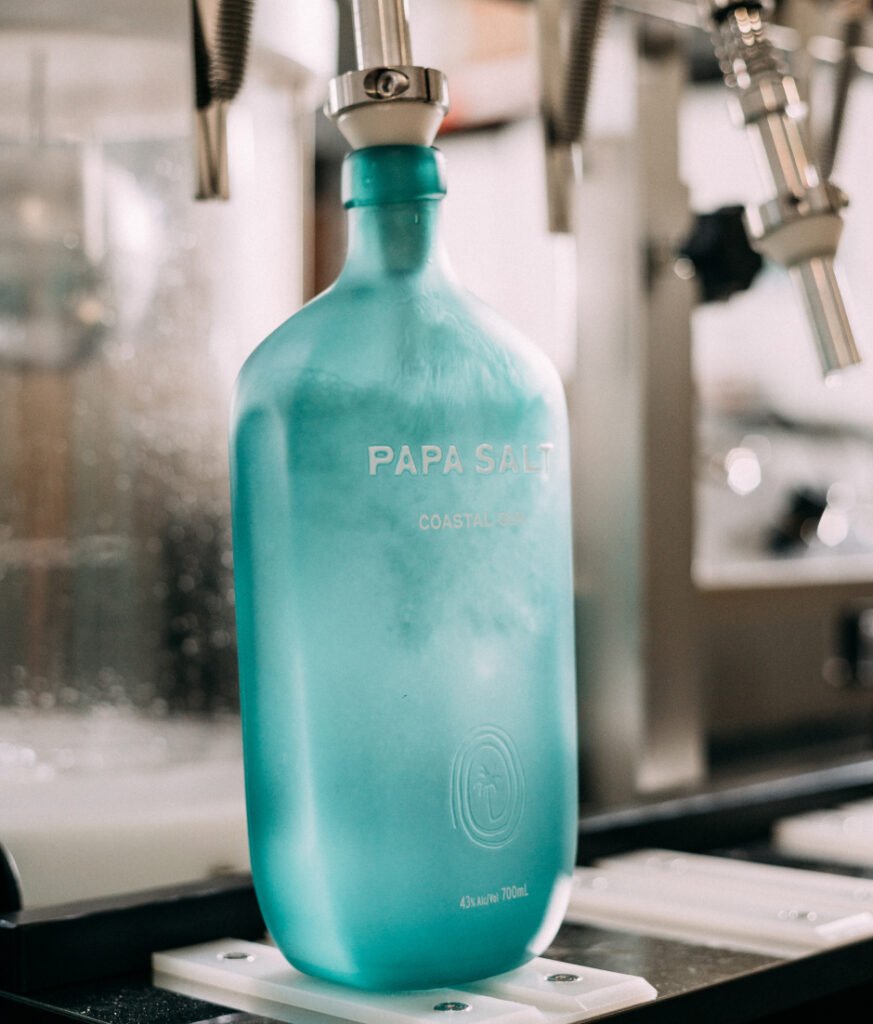
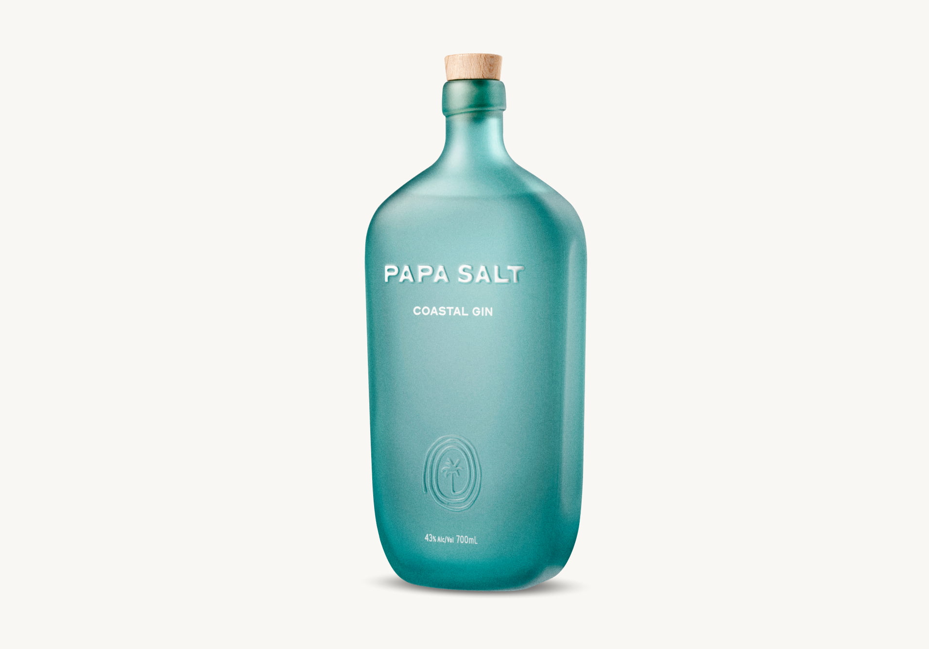
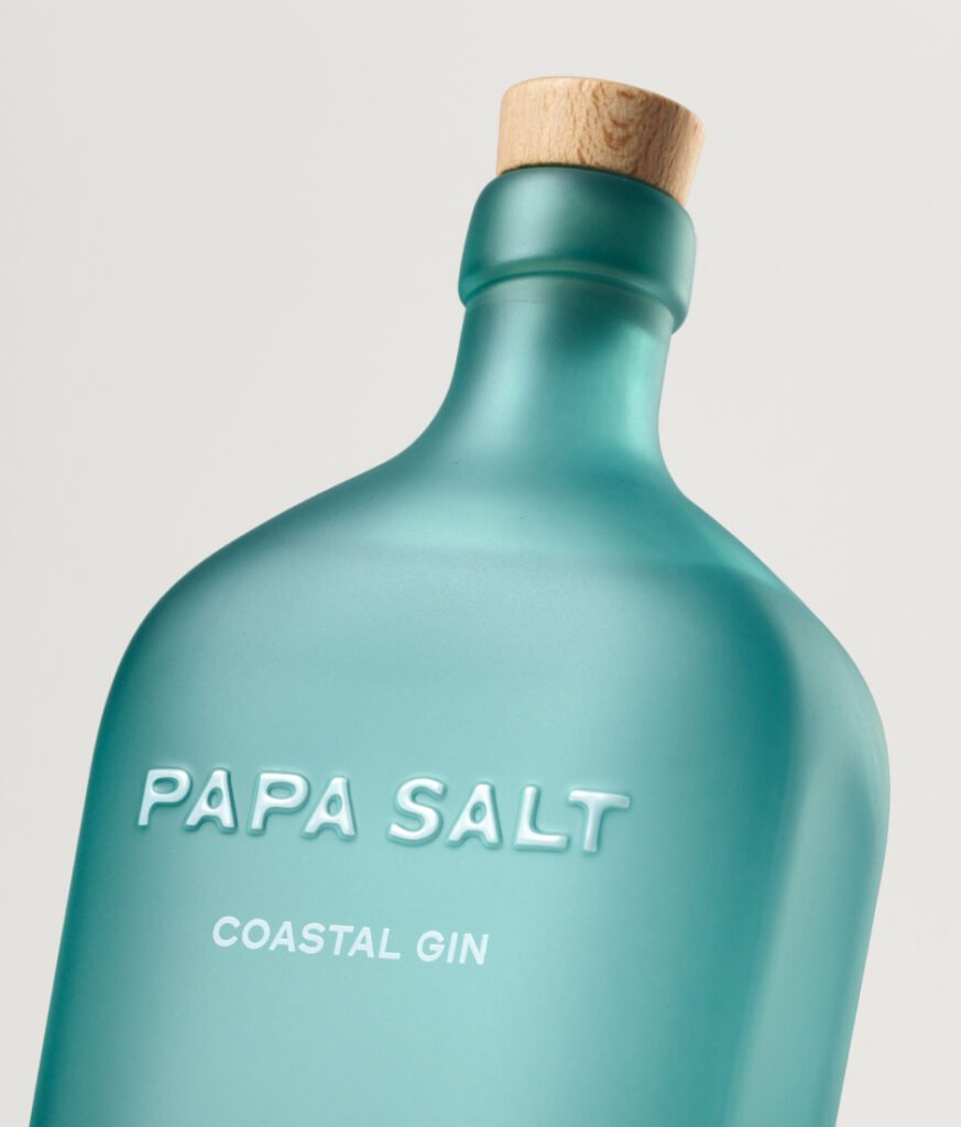
Our response was intentional simplicity in design that cut through the category and cast a fresh light on Australian gin. We reduced the design down to its bare essentials: a distinctive form with edges smoothed over as if shaped by the sea over time, an aqua-like blue to radiate freshness and a proud brand moment that alludes to a coastal story yet to be told.
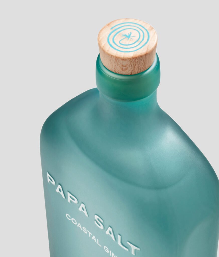
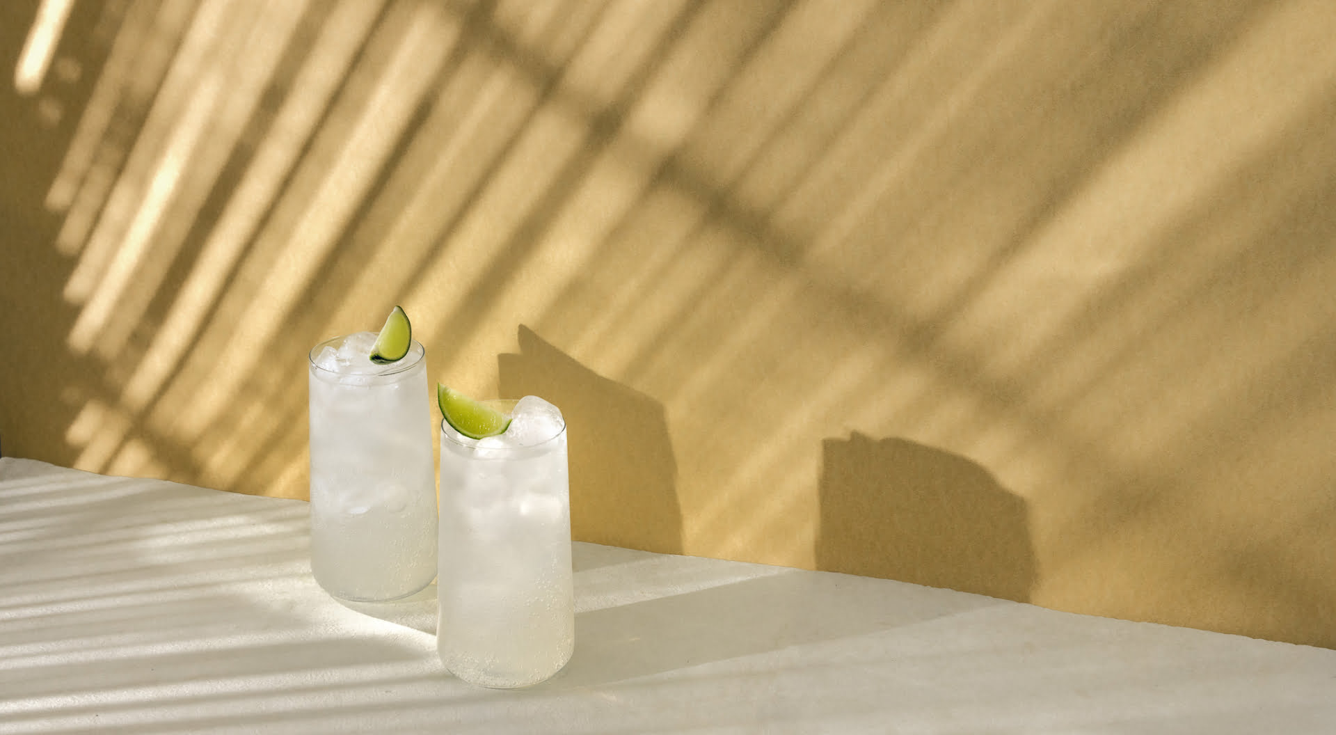
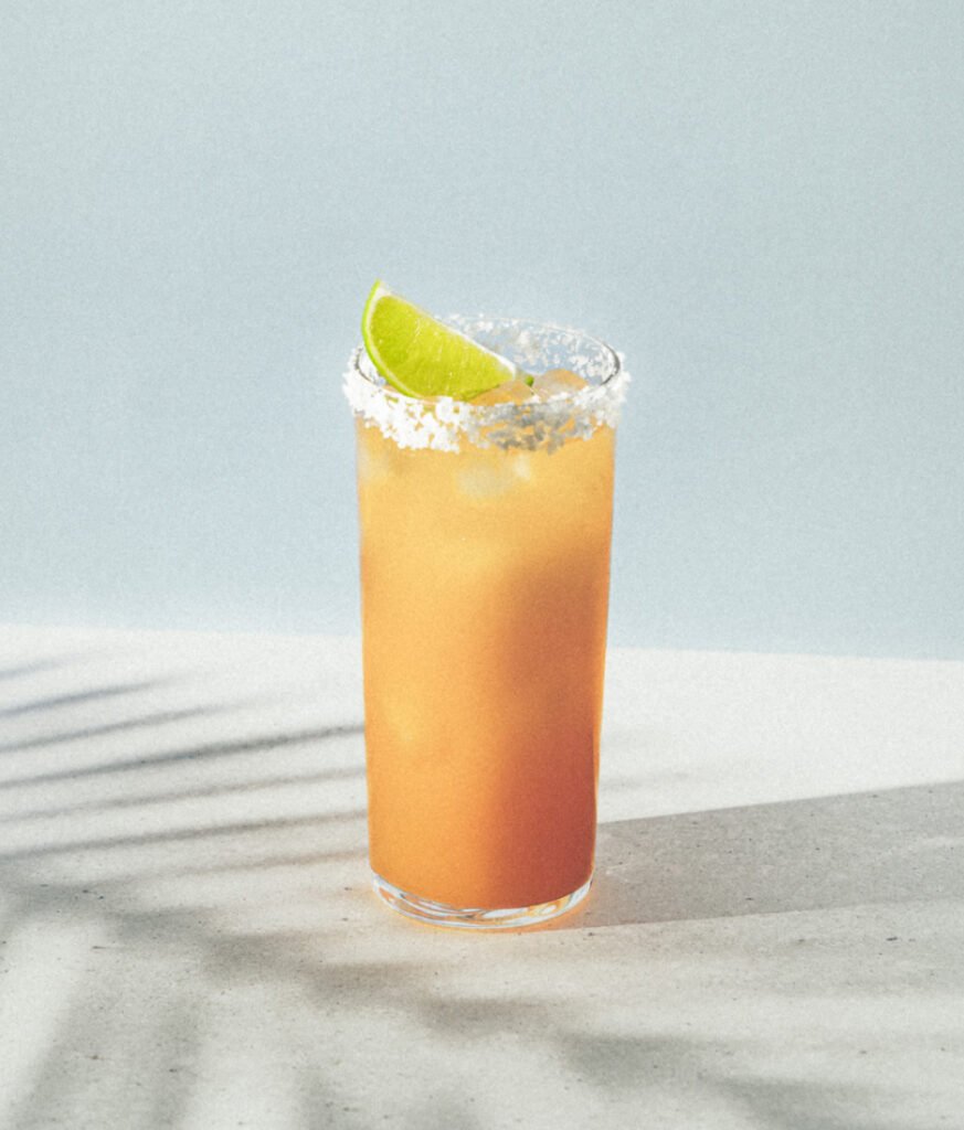
Portability and an easiness in hand adds to the sessionability of the liquid. This gin is an easy sipper best served with soda and citrus (the founders’ go-to). The rounded cubic profile borrows attributes from a hip flask—the perfect form for slinging into your bag. Indented side contours offer a comfortable grip in hand that feels effortless yet luxurious. Custom matte blue coating radiates with coastal freshness on the shelf, whilst purposely blocking back label show through.
Sustainability is always at the heart of our design approach at Squad Ink—Papa Salt’s compact form and naked bottle aesthetic continue to underpin that ethos. Both give the bottle a chance for a second life by encouraging re-use as a water bottle or vase. Considerations around glass weight reduce both shipping costs and the environmental impact.
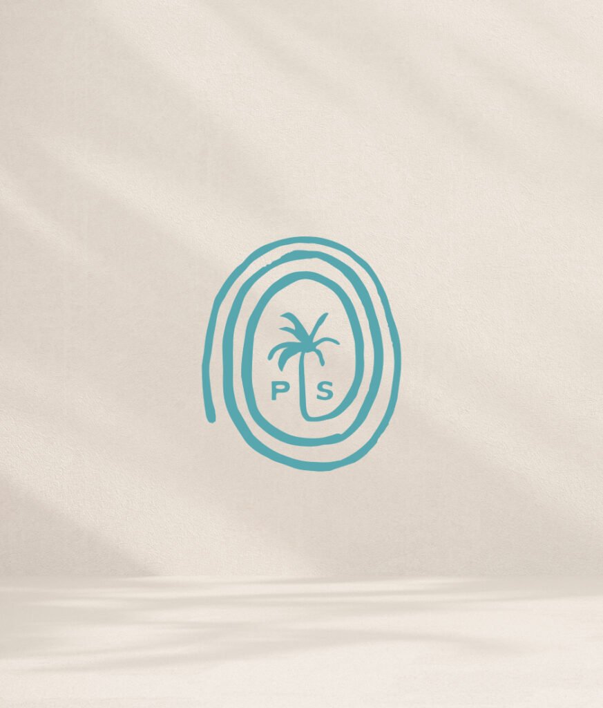
Flowing on from the organic bottle form, the wordmark and brand mark are as if sketched by hand on a napkin at a beach club. ‘Endless stories and memories from summer escapades together as friends’ has been channelled into the symbol of a spiralling palm tree.
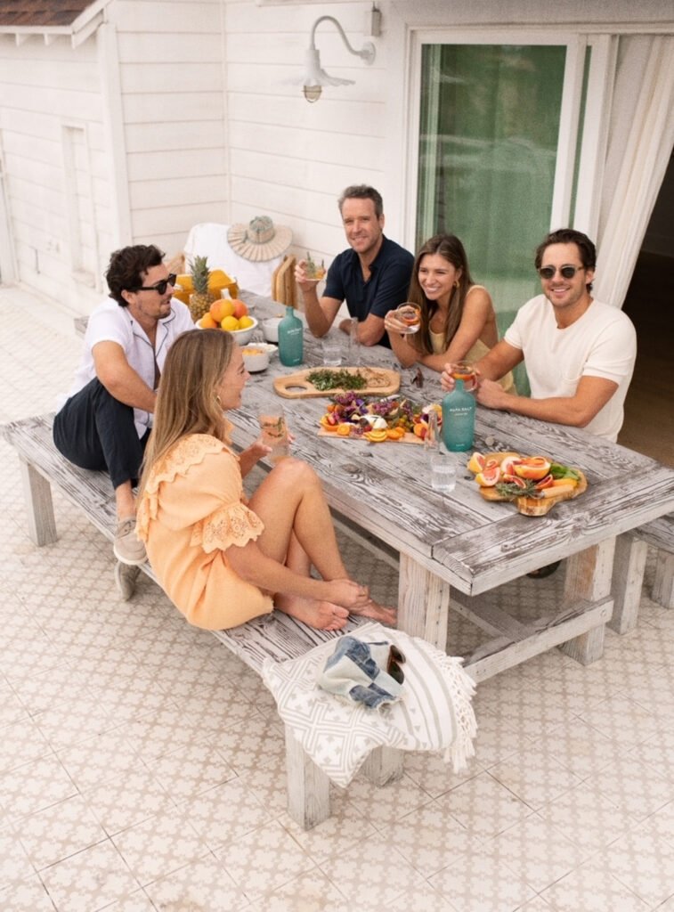
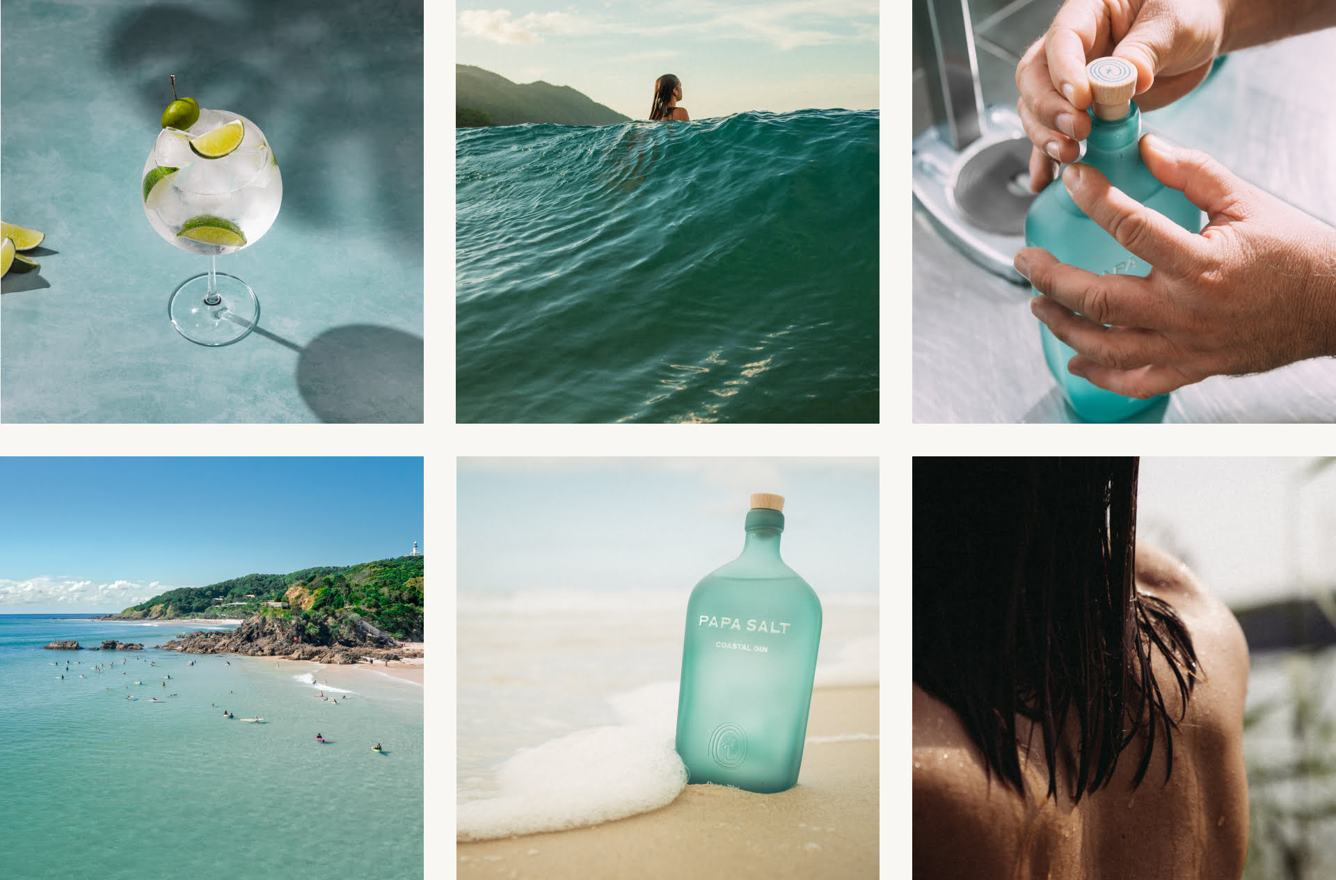
Imagery and the written word become a window into the Papa Salt way of life. We created a brand playbook that sets the tone for social media and marketing that transports the customer seaside with a gin in hand and sun warming their skin.
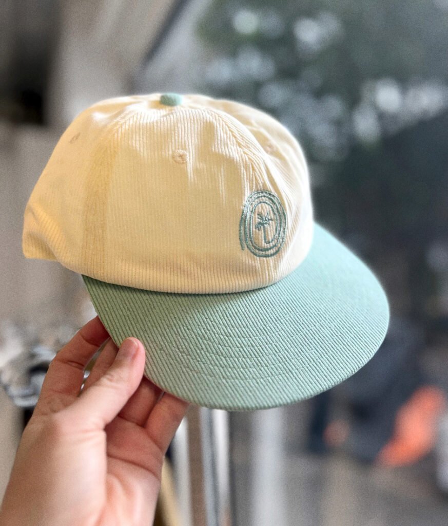
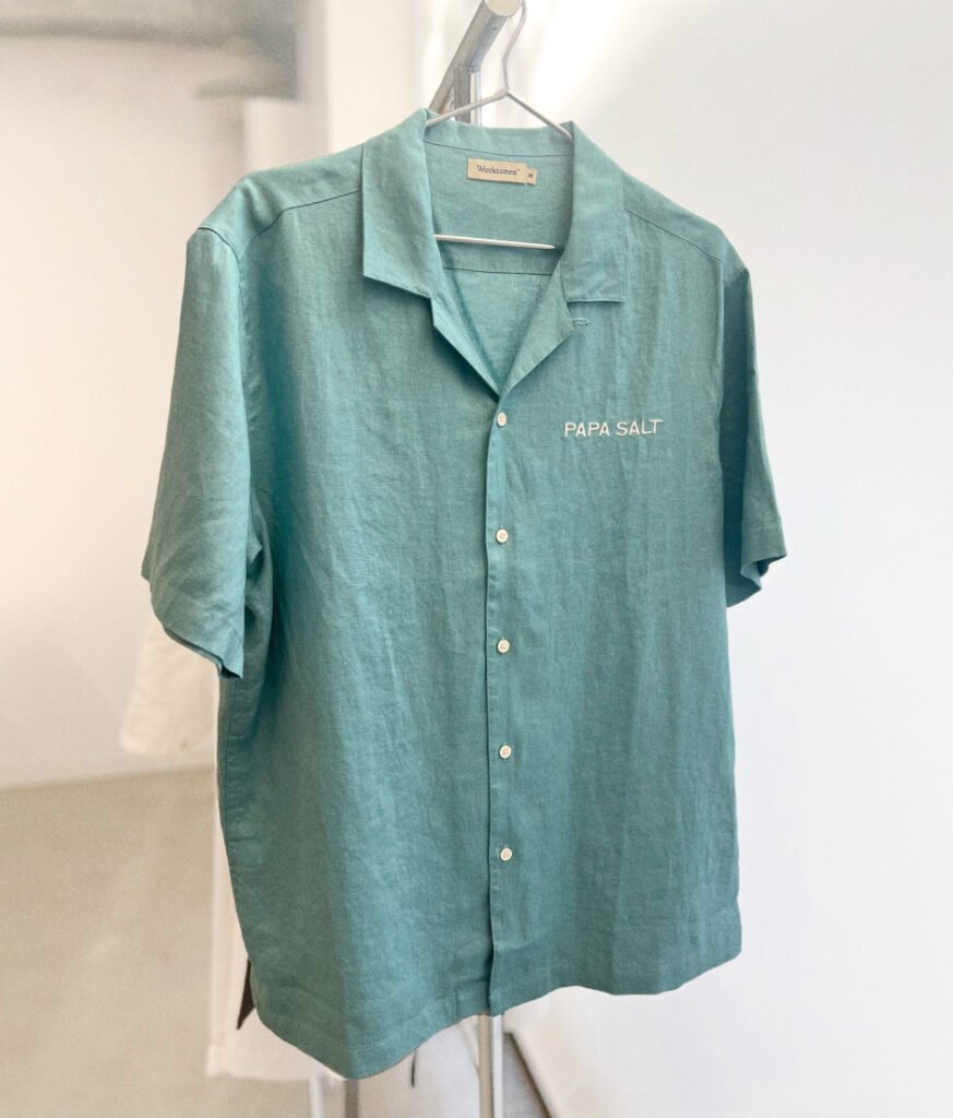
From t-shirts, loose cotton shirts and corduroy caps, we created Papa Salt Merch that people want to get their hands on.
Our aim was to capture the founders’ personal gin expression with a differentiated approach and with marketable appeal. As a team effort this project was a success. We were able to uncover and capture that essence into a bottle and brand that far exceeded everyone’s expectations. Sending out a big thank you to Josey McNamara, Margot Robbie, Tom Ackerley, Regan & Charlie Maas for trusting in us to bring Papa Salt to life.
GOLD – Pentawards 2024
International Beverage
GOLD – Food & Beverage
Sydney Design Awards 2023
GOLD – Pentawards 2024
International Beverage
GOLD – Food & Beverage
Sydney Design Awards 2023
Art Direction
Brand Identity
Brand Strategy
Key Messaging
Packaging
Social Media
Website
Sign up to be the first to know about updates, new projects, and all things SQUAD.